Brand identity design is the process of creating the visual and verbal system that makes your business recognizable: your logo, colors, typography, imagery, voice and the guidelines that hold them together. Done well, it helps customers remember you and trust you across every touchpoint.
This guide clears up the difference between a brand, a brand identity and a logo, breaks down each component, walks through a typical design process and covers the mistakes to avoid. It also explains when a rebrand genuinely makes sense.
Key takeaways
- A logo is one part of a brand identity, and a brand identity is one expression of your brand.
- A strong identity is a flexible system, not a single graphic.
- Brand guidelines keep everything consistent as your team and channels grow.
- Rebrand for strategic reasons, such as a new audience or direction, not boredom.
Brand vs brand identity vs logo
These three terms are often used interchangeably, but they mean different things.
| Term | What it is | Example question it answers |
|---|---|---|
| Brand | The overall perception people hold of your business | What do customers think and feel about us? |
| Brand identity | The deliberate visual and verbal system you create | How do we look, sound and present ourselves? |
| Logo | A single mark that identifies the business | What symbol or wordmark represents us? |
You control your brand identity directly. Your brand, however, is shaped by every experience people have with you, from your website to your customer service. A good identity supports that experience; it cannot replace it.
The core components of a brand identity
Logo system
Think of the logo as a family rather than a single file. A complete system usually includes a primary logo, a secondary or stacked version, a compact icon or monogram, and versions for light and dark backgrounds. Each should stay legible at small sizes, such as a favicon or social profile picture.
Color palette
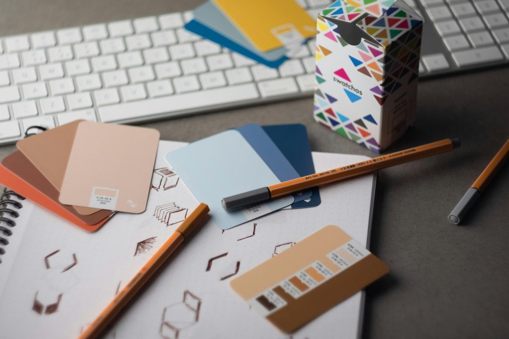
A palette typically includes one or two primary colors, a few supporting colors and neutrals for backgrounds and text. Define exact values for print and screen, and check that text and background combinations have enough contrast to be readable.
Typography
Most identities use one or two typefaces: one for headings and one for body text. Choose fonts that are licensed for your intended uses, read well on screens and suit your personality, whether that is modern, traditional, playful or technical.
Imagery and graphic elements
Photography style, illustration, icons, patterns and shapes all contribute. Decide whether your photos feel bright and candid or calm and polished, and keep that direction consistent.
Brand voice
Your identity is also verbal. Define how you sound: formal or friendly, bold or reassuring, technical or plain-spoken. A few clear examples of preferred and avoided phrases make the voice easier to apply.
Brand guidelines
Guidelines document how everything is used, including logo spacing, minimum sizes, color values, type hierarchy, image style and tone of voice. They let designers, marketers and partners stay consistent without guessing.
The brand identity design process
- Discovery. Clarify your business goals, audience, competitors, values and what makes you different. Interviews and workshops help here.
- Strategy. Define your positioning, personality and key messages. This becomes the brief every design decision is measured against.
- Exploration. Create mood boards and early concepts to test different visual directions.
- Design development. Refine the chosen direction into a full logo system, palette, typography and supporting elements.
- Application. Test the identity on real items, such as your website, social posts, packaging, signage and presentations.
- Guidelines and handover. Document the rules and deliver organized files in the formats your team needs.
Your website is often where an identity is seen most. If you are refreshing the brand, it is a natural moment to consider a website redesign as well.
Common brand identity mistakes
- Starting with the logo. Without strategy first, design choices become a matter of personal taste.
- Chasing trends. A look that feels fresh today can date quickly. Aim for something that will age well.
- Too many colors and fonts. Restraint makes an identity easier to recognize and easier to apply.
- Ignoring small sizes. Detailed logos can turn into a blur on a phone screen or app icon.
- Forgetting accessibility. Low-contrast palettes and hard-to-read fonts shut people out.
- No guidelines. Without documentation, the identity drifts as different people create materials.
- Inconsistent rollout. Old logos lingering on social profiles, invoices or signage weaken recognition.
When to rebrand, and when to refresh
A full rebrand changes your identity in a significant way, sometimes including your name or positioning. A refresh keeps the core recognizable while modernizing details. Consider a change when:
- Your business has moved into new services, markets or audiences that the current identity does not reflect.
- You have merged with or acquired another company.
- Your identity looks dated next to the quality of your work.
- Your visuals are inconsistent and hard to use across digital channels.
- Your name or look causes genuine confusion with others in your space.
If the main issue is that you are simply tired of seeing your logo, that is usually not enough. Customers often value familiarity more than owners expect, so a careful refresh may be the better route.
Frequently asked questions
How long does brand identity design take?
It depends on the scope, the number of stakeholders and how many applications need designing. A focused identity takes less time than a full system with extensive guidelines and assets.
What files should I receive at the end?
Expect vector logo files, web-ready formats, color values for print and screen, font details and a brand guidelines document. Make sure you own the final files.
Can a small business have a strong brand identity?
Yes. A simple, consistent identity applied carefully can look just as professional as a large company’s, and is often easier to maintain.
Should my brand voice be part of the identity?
Yes. How you write and speak shapes perception as much as visuals do, so define it alongside your logo and colors.
Ready to build an identity people remember?
Tech Baksho helps businesses shape brand strategy, visual identity and guidelines that stay consistent from website to packaging.